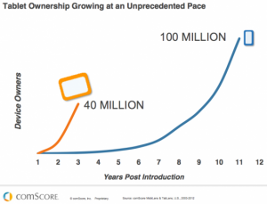
 We all know the stats. The adoption of mobile technologies is far and away the fastest we have adopted any other technologies. Smartphone adoption was/is historical. Tablet adoption (and yes, I consider tablets mobile devices) is on a much steeper curve. These are not just phones and media consumption devices. People now carry around in their pockets more computing power than a room full of computers could provide 20 years ago! It’s estimated that some time in the next two years, more people will be accessing the internet via mobile devices than by traditional laptop and desktop devices. We are way past the time where everyone should have a strategy to take advantage of this. So, what to do?
First, understand the mobile context. People use mobile devices differently than they do desktop and laptop computers. Beyond the obvious physical differences, there is also a more personal nature to these devices, and the expectation of a personalized experience when using them, including control of what’s on them. Add in location. It’s just as likely that a mobile device will be used while riding a subway or walking down the street as it is in an office setting. In many cases, it’s logical and expected that location will be taken into consideration as a factor in considering what is being delivered to the user. All of these “mobile contexts” place a premium on “getting it right” or mobile users will simply delete you from their devices.
Second, design for the user’s experience, not your own. I know you’ve heard a lot about responsive design, and how that allows your current website to “fit” on mobile devices. However, your current website, the overall concepts behind it, its look and feel, were probably all designed to work on a full desktop or laptop screen. Shrinking that experience down or shifting things around won’t make for a better user-experience on a mobile device. Don’t shrink it, rethink it! Ask yourself, “What would a mobile user most likely be trying to do with me? How much time might they have? What problem are they trying to solve?” Mobile is as much about choice as anything. When designing the mobile experience, think task not brand. Think convenience store, not supermarket. The mobile context, combined with the size of devices (especially smartphones), demands a reengineering of navigation, average time of user sessions, location awareness, and a number of other facets that a traditional website need not worry about.
Third, and most importantly, understand the opportunity. Last year, leading researcher IDC Research collected online data from 7,446 Android and iPhone users ages 18 to 44 during a week in March. The results indicated that 79 percent of people aged 18-44 have their smartphones with them 22 hours a day! It’s there whenever they need it which means you can be there whenever they need you. With mobile, we have the unique opportunity to be present at the point of need.
Leave a Reply